Note
Go to the end to download the full example code. or to run this example in your browser via Binder
Benchmark Visualization Example
This example demonstrates comprehensive benchmark result visualization in Kaira, including BER curve plotting, throughput performance, modulation comparisons, and performance summary generation.
The visualization system provides:
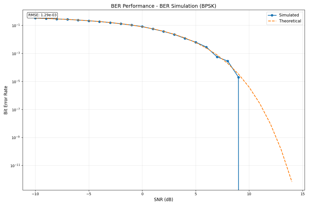
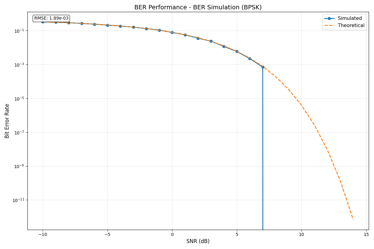
BER curve plotting with theoretical and simulated results
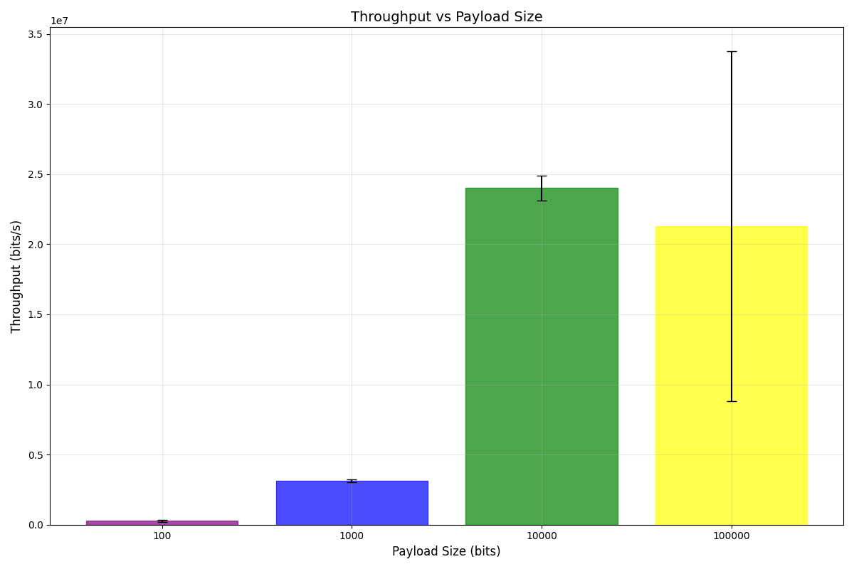
Throughput performance analysis across different payload sizes
Comparative visualization of multiple algorithms or configurations
Automated report generation with statistical summaries
Customizable plotting styles and formats
Setting up the Environment
First, let’s import the necessary modules for benchmark visualization.
import json
from pathlib import Path

import matplotlib.pyplot as plt
import numpy as np

from kaira.benchmarks import BenchmarkConfig, BenchmarkVisualizer, StandardRunner, get_benchmark

# Set random seed for reproducibility
np.random.seed(42)
Running and Visualizing BER Benchmarks
Let’s create and visualize BER simulation results.
def run_visualization_example():
    """Run benchmark visualization example."""
    print("Kaira Benchmark Visualization Example")
    print("=" * 50)

    # Create output directory
    output_dir = Path("./visualization_results")
    output_dir.mkdir(exist_ok=True)

    # Create benchmarks
    print("\n1. Running BER simulation benchmark...")
    ber_benchmark = get_benchmark("ber_simulation")(modulation="bpsk")

    # Configure benchmark - use block_length instead of num_bits
    config = BenchmarkConfig(snr_range=list(range(-2, 11)), block_length=50000, verbose=True)

    # Run benchmark with num_bits as runtime parameter
    runner = StandardRunner()
    ber_result = runner.run_benchmark(ber_benchmark, num_bits=50000, **config.to_dict())

    print(f"✓ BER simulation completed in {ber_result.execution_time:.2f}s")

    # Create visualizer
    visualizer = BenchmarkVisualizer(figsize=(12, 8))

    # Plot BER curve
    print("\n2. Creating BER curve visualization...")
    visualizer.plot_ber_curve(ber_result.metrics, save_path=str(output_dir / "ber_curve.png"))
    print("✓ BER curve saved to visualization_results/ber_curve.png")

    # Run throughput benchmark
    print("\n3. Running throughput benchmark...")
    throughput_benchmark = get_benchmark("throughput_test")()
    throughput_result = runner.run_benchmark(throughput_benchmark, data_sizes=[1000, 5000, 10000, 50000, 100000], num_trials=3)

    print(f"✓ Throughput test completed in {throughput_result.execution_time:.2f}s")

    # Plot throughput results
    print("\n4. Creating throughput visualization...")
    visualizer.plot_throughput_comparison(throughput_result.metrics, save_path=str(output_dir / "throughput_comparison.png"))
    print("✓ Throughput plot saved to visualization_results/throughput_comparison.png")

    # Create comparison plot if we have multiple results
    print("\n5. Running parameter comparison...")

    # Compare different modulation schemes using appropriate benchmarks
    comparison_results = []
    modulation_labels = []

    # BPSK using BER simulation benchmark
    print("   Running BPSK simulation...")
    bpsk_benchmark = get_benchmark("ber_simulation")(modulation="bpsk")
    bpsk_result = runner.run_benchmark(bpsk_benchmark, snr_range=list(range(0, 16, 2)), num_bits=20000)
    comparison_results.append(bpsk_result.metrics)
    modulation_labels.append("BPSK")

    # 4-QAM (QPSK) using QAM benchmark
    print("   Running QPSK simulation...")
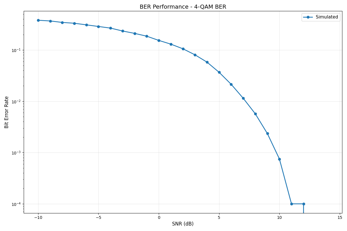
    qpsk_benchmark = get_benchmark("qam_ber")(constellation_size=4)
    qpsk_result = runner.run_benchmark(qpsk_benchmark, snr_range=list(range(0, 16, 2)), num_symbols=10000)
    comparison_results.append(qpsk_result.metrics)
    modulation_labels.append("QPSK")

    # 16-QAM using QAM benchmark
    print("   Running 16-QAM simulation...")
    qam16_benchmark = get_benchmark("qam_ber")(constellation_size=16)
    qam16_result = runner.run_benchmark(qam16_benchmark, snr_range=list(range(0, 16, 2)), num_symbols=10000)
    comparison_results.append(qam16_result.metrics)
    modulation_labels.append("16-QAM")

    # Plot comparison
    print("\n6. Creating modulation comparison plot...")
    # Create individual BER plots for each modulation scheme
    for i, (mod_label, result_metrics) in enumerate(zip(modulation_labels, comparison_results)):
        plot_name = f"ber_curve_{mod_label.lower().replace('-', '')}.png"
        visualizer.plot_ber_curve(result_metrics, save_path=str(output_dir / plot_name))
        print(f"✓ {mod_label} BER curve saved to visualization_results/{plot_name}")

    # Create a combined comparison plot manually using matplotlib
    plt.figure(figsize=(12, 8))
    for mod_label, result_metrics in zip(modulation_labels, comparison_results):
        snr_range = result_metrics.get("snr_range", [])
        if "ber_simulated" in result_metrics:
            plt.semilogy(snr_range, result_metrics["ber_simulated"], "o-", label=f"{mod_label} (Simulated)", linewidth=2, markersize=6)
        elif "ber_results" in result_metrics:
            plt.semilogy(snr_range, result_metrics["ber_results"], "o-", label=f"{mod_label} (Simulated)", linewidth=2, markersize=6)
        if "ber_theoretical" in result_metrics:
            plt.semilogy(snr_range, result_metrics["ber_theoretical"], "--", label=f"{mod_label} (Theoretical)", linewidth=2)

    plt.xlabel("SNR (dB)", fontsize=12)
    plt.ylabel("Bit Error Rate", fontsize=12)
    plt.title("Modulation Scheme Comparison", fontsize=14)
    plt.grid(True, alpha=0.3)
    plt.legend(fontsize=11)
    plt.tight_layout()
    plt.savefig(str(output_dir / "modulation_comparison.png"), dpi=100, bbox_inches="tight")
    plt.show()  # Show the plot for sphinx-gallery
    plt.close()

    print("✓ Modulation comparison saved to visualization_results/modulation_comparison.png")

    # Create summary statistics plot
    print("\n7. Creating performance summary...")
    # Create a summary of benchmark results by saving them to a JSON file first

    summary_data = {
        "summary": {"total_benchmarks": 2, "successful_benchmarks": 2, "failed_benchmarks": 0, "total_execution_time": ber_result.execution_time + throughput_result.execution_time, "average_execution_time": (ber_result.execution_time + throughput_result.execution_time) / 2},
        "benchmark_results": [
            {"benchmark_name": "BER Simulation (BPSK)", "success": True, "execution_time": ber_result.execution_time, "device": "cpu", **ber_result.metrics},
            {"benchmark_name": "Throughput Test", "success": True, "execution_time": throughput_result.execution_time, "device": "cpu", **throughput_result.metrics},
        ],
    }

    # Save temporary summary file
    summary_file = output_dir / "temp_summary.json"
    with open(summary_file, "w") as f:
        json.dump(summary_data, f, indent=2, default=str)

    # Create benchmark summary plot
    visualizer.plot_benchmark_summary(str(summary_file), save_path=str(output_dir / "performance_summary.png"))

    # Clean up temporary file
    summary_file.unlink()

    print("✓ Performance summary saved to visualization_results/performance_summary.png")

    print("\n" + "=" * 50)
    print("✅ Visualization example completed successfully!")
    print("📁 All plots saved to:", output_dir.absolute())
    print("\nGenerated visualizations:")
    print("  • ber_curve.png - BER vs SNR curve")
    print("  • throughput_comparison.png - Throughput performance")
    print("  • modulation_comparison.png - Modulation scheme comparison")
    print("  • performance_summary.png - Overall performance summary")
Execute the visualization example
run_visualization_example()
Kaira Benchmark Visualization Example
==================================================

1. Running BER simulation benchmark...
Running benchmark: BER Simulation (BPSK)
  ✓ Completed in 0.02s
✓ BER simulation completed in 0.02s

2. Creating BER curve visualization...
✓ BER curve saved to visualization_results/ber_curve.png

3. Running throughput benchmark...
Running benchmark: Throughput Test
  ✓ Completed in 0.03s
✓ Throughput test completed in 0.03s

4. Creating throughput visualization...
✓ Throughput plot saved to visualization_results/throughput_comparison.png

5. Running parameter comparison...
   Running BPSK simulation...
Running benchmark: BER Simulation (BPSK)
  ✓ Completed in 0.01s
   Running QPSK simulation...
Running benchmark: 4-QAM BER
  ✓ Completed in 1.63s
   Running 16-QAM simulation...
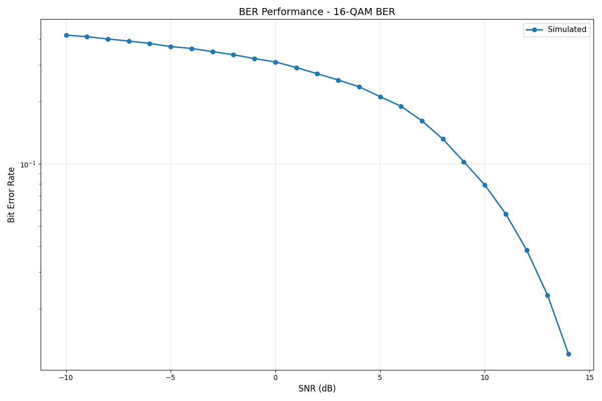
Running benchmark: 16-QAM BER
  ✓ Completed in 2.35s

6. Creating modulation comparison plot...
✓ BPSK BER curve saved to visualization_results/ber_curve_bpsk.png
✓ QPSK BER curve saved to visualization_results/ber_curve_qpsk.png
✓ 16-QAM BER curve saved to visualization_results/ber_curve_16qam.png
✓ Modulation comparison saved to visualization_results/modulation_comparison.png

7. Creating performance summary...
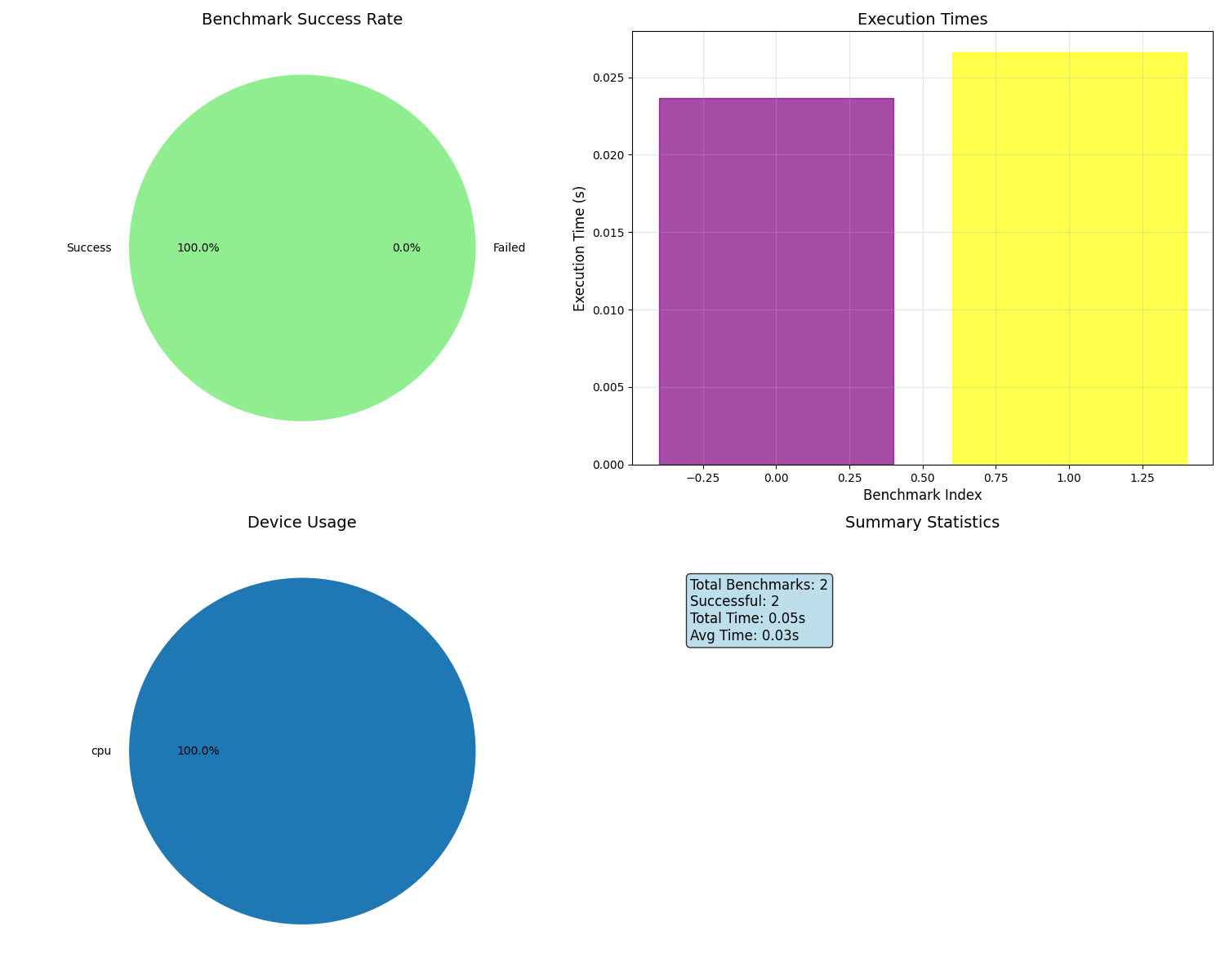
✓ Performance summary saved to visualization_results/performance_summary.png

==================================================
✅ Visualization example completed successfully!
📁 All plots saved to: /home/runner/work/kaira/kaira/examples/benchmarks/visualization_results

Generated visualizations:
  • ber_curve.png - BER vs SNR curve
  • throughput_comparison.png - Throughput performance
  • modulation_comparison.png - Modulation scheme comparison
  • performance_summary.png - Overall performance summary
Summary
This example demonstrated the comprehensive visualization capabilities of the Kaira benchmarking system:
BER Curve Plotting: Visualizing bit error rate performance vs. SNR
Throughput Analysis: Comparing performance across different data payload sizes
Modulation Comparisons: Side-by-side comparison of different modulation schemes
Performance Summaries: Automated generation of comprehensive performance reports
Customizable Plots: Flexible visualization options with matplotlib integration
The visualization system makes it easy to understand benchmark results and communicate findings through clear, publication-ready plots and comprehensive performance summaries.
Total running time of the script: (0 minutes 6.542 seconds)
