Note
Go to the end to download the full example code. or to run this example in your browser via Binder
Correlation Models for Data Generation
This example demonstrates the correlation models in Kaira, which are useful for simulating statistical correlations between data sources in distributed source coding scenarios like Wyner-Ziv coding.
import matplotlib.pyplot as plt
import numpy as np
import torch

from kaira.data import WynerZivCorrelationDataset, create_binary_tensor, create_uniform_tensor
from kaira.models.wyner_ziv import WynerZivCorrelationModel

# Plotting imports
from kaira.utils.plotting import PlottingUtils

PlottingUtils.setup_plotting_style()
Imports and Setup
Correlation Models Configuration and Setup
# Set random seed for reproducibility
torch.manual_seed(42)
np.random.seed(42)
1. Introduction to Wyner-Ziv Correlation Models
In Wyner-Ziv coding, there is correlation between the source X and the side information Y available at the decoder. This correlation is critical as it determines the theoretical rate bounds and practical coding efficiency.
# First, let's create a source signal
n_samples = 1
n_features = 1000
source = create_uniform_tensor(size=[n_samples, n_features], low=0.0, high=1.0)

# We'll create different correlation models to demonstrate the relationships
# between the source and side information
2. Gaussian Correlation Model
The Gaussian correlation model adds Gaussian noise to the source. This is equivalent to passing the source through an AWGN channel.
# Create a correlation model with Gaussian noise
sigma_values = [0.1, 0.3, 0.5]
gaussian_models = []
gaussian_side_info = []

for sigma in sigma_values:
    model = WynerZivCorrelationModel(correlation_type="gaussian", correlation_params={"sigma": sigma})
    gaussian_models.append(model)
    # Generate correlated side information
    with torch.no_grad():
        side_info = model(source)
    gaussian_side_info.append(side_info)
Visualizing Gaussian Correlation
Gaussian Correlation Visualization
Let’s visualize the relationship between the source and side information for different noise levels.
fig, axes = plt.subplots(4, 1, figsize=(15, 10))

# Only show a segment for clarity
segment_size = 100
segment_start = 0
segment_end = segment_start + segment_size

# Plot original source
axes[0].plot(source[0, segment_start:segment_end].numpy(), "b-", label="Source X")
axes[0].set_title("Original Source Signal")
axes[0].set_ylabel("Amplitude")
axes[0].grid(True, alpha=0.3)
axes[0].legend()

# Plot side information for each sigma value
colors = ["g", "r", "m"]
for i, (sigma, side_info) in enumerate(zip(sigma_values, gaussian_side_info)):
    axes[i + 1].plot(source[0, segment_start:segment_end].numpy(), "b-", label="Source X")
    axes[i + 1].plot(side_info[0, segment_start:segment_end].numpy(), colors[i] + "-", label=f"Side Info Y (σ={sigma})")
    axes[i + 1].set_title(f"Gaussian Correlation (σ={sigma})")
    axes[i + 1].set_ylabel("Amplitude")
    axes[i + 1].grid(True, alpha=0.3)
    axes[i + 1].legend()

axes[-1].set_xlabel("Sample Index")
plt.tight_layout()
plt.show()

Visualizing the Statistical Dependence
Statistical Dependence Visualization
Let’s plot the joint distribution of X and Y to visualize the correlation strength.
fig, axes = plt.subplots(1, 3, figsize=(15, 5))

for i, (sigma, side_info) in enumerate(zip(sigma_values, gaussian_side_info)):
    axes[i].scatter(source.numpy().flatten(), side_info.numpy().flatten(), alpha=0.3, s=10)
    axes[i].set_title(f"Joint Distribution (σ={sigma})")
    axes[i].set_xlabel("Source X")
    axes[i].set_ylabel("Side Information Y")

    # Add regression line to visualize correlation
    z = np.polyfit(source.numpy().flatten(), side_info.numpy().flatten(), 1)
    p = np.poly1d(z)
    axes[i].plot([0, 1], [p(0), p(1)], "r--", alpha=0.8)

    # Calculate and display correlation coefficient
    corr_coef = np.corrcoef(source.numpy().flatten(), side_info.numpy().flatten())[0, 1]
    axes[i].text(0.05, 0.95, f"Correlation: {corr_coef:.4f}", transform=axes[i].transAxes, fontsize=12, verticalalignment="top", bbox=dict(boxstyle="round", facecolor="white", alpha=0.8))

    axes[i].grid(True, alpha=0.3)

plt.tight_layout()
plt.show()

3. Binary Symmetric Channel Correlation
For binary sources, we can model correlation as a Binary Symmetric Channel (BSC) where bits are flipped with probability p.
# Create a binary source
binary_source = create_binary_tensor(size=[1, n_features], prob=0.5)

# Create correlation models with different crossover probabilities
crossover_probs = [0.05, 0.1, 0.3]
binary_models = []
binary_side_info = []

for crossover_p in crossover_probs:
    model = WynerZivCorrelationModel(correlation_type="binary", correlation_params={"crossover_prob": crossover_p})
    binary_models.append(model)
    # Generate correlated side information
    with torch.no_grad():
        side_info = model(binary_source)
    binary_side_info.append(side_info)
Visualizing Binary Correlation
Let’s visualize the relationship between the binary source and side information for different crossover probabilities.
plt.figure(figsize=(15, 10))

# Only show a segment for clarity
segment_size = 50
segment_start = 0
segment_end = segment_start + segment_size

# Plot original binary source
ax1 = plt.subplot(4, 1, 1)
plt.step(np.arange(segment_size), binary_source[0, segment_start:segment_end].numpy(), "b-", where="mid", label="Source X")
plt.title("Original Binary Source")
plt.ylabel("Value")
plt.ylim(-0.1, 1.1)
plt.grid(True, alpha=0.3)
plt.legend()

# Plot side information for each crossover probability
colors = ["g", "r", "m"]
for i, (crossover_prob, side_info) in enumerate(zip(crossover_probs, binary_side_info)):
    ax = plt.subplot(4, 1, i + 2, sharex=ax1)
    plt.step(np.arange(segment_size), binary_source[0, segment_start:segment_end].numpy(), "b-", where="mid", label="Source X")
    plt.step(np.arange(segment_size), side_info[0, segment_start:segment_end].numpy(), colors[i] + "-", where="mid", label=f"Side Info Y (p={crossover_prob})")

    # Highlight the flipped bits
    flipped = binary_source[0, segment_start:segment_end] != side_info[0, segment_start:segment_end]
    flipped_indices = np.where(flipped.numpy())[0]
    if len(flipped_indices) > 0:
        plt.scatter(flipped_indices, side_info[0, segment_start:segment_end][flipped].numpy(), s=100, facecolors="none", edgecolors="black")

    plt.title(f"Binary Symmetric Channel Correlation (p={crossover_prob})")
    plt.ylabel("Value")
    plt.ylim(-0.1, 1.1)
    plt.grid(True, alpha=0.3)
    plt.legend()

plt.xlabel("Sample Index")
plt.tight_layout()
plt.show()

4. Custom Correlation Models
WynerZivCorrelationModel also supports custom correlation models through a user-defined transformation function.
# Define a custom transformation function
def custom_transform(x):
    """A custom correlation model where Y = 0.8*X + 0.2*sin(2πX) This introduces both linear
    correlation and nonlinear distortion."""
    return 0.8 * x + 0.2 * torch.sin(2 * np.pi * x)


# Create a custom correlation model
custom_model = WynerZivCorrelationModel(correlation_type="custom", correlation_params={"transform_fn": custom_transform})

# Generate source and correlated side information
source = create_uniform_tensor(size=[1, n_features], low=0.0, high=1.0)
with torch.no_grad():
    custom_side_info = custom_model(source)
Visualizing Custom Correlation
Let’s visualize the relationship for our custom correlation model.
plt.figure(figsize=(12, 10))

# Plot the signals
plt.subplot(2, 1, 1)
plt.plot(source[0, segment_start:segment_end].numpy(), "b-", label="Source X")
plt.plot(custom_side_info[0, segment_start:segment_end].numpy(), "g-", label="Side Info Y (Custom)")
plt.title("Custom Correlation Model")
plt.ylabel("Amplitude")
plt.grid(True, alpha=0.3)
plt.legend()

# Plot the joint distribution
plt.subplot(2, 1, 2)
plt.scatter(source.numpy().flatten(), custom_side_info.numpy().flatten(), alpha=0.3, s=10)
plt.title("Joint Distribution (Custom Model)")
plt.xlabel("Source X")
plt.ylabel("Side Information Y")
plt.grid(True, alpha=0.3)

# Plot the theoretical curve Y = 0.8*X + 0.2*sin(2πX)
x_vals = np.linspace(0, 1, 100)
y_vals = 0.8 * x_vals + 0.2 * np.sin(2 * np.pi * x_vals)
plt.plot(x_vals, y_vals, "r-", alpha=0.8, label="Theoretical Y = 0.8X + 0.2sin(2πX)")
plt.legend()

plt.tight_layout()
plt.show()

5. Using the WynerZivCorrelationDataset
Kaira provides a dataset class that pairs source data with correlated side information according to a specified model.
# Generate source data
n_samples = 1000
feature_dim = 8
source_data = create_uniform_tensor(size=[n_samples, feature_dim], low=0.0, high=1.0)

# Create datasets with different correlation types
gaussian_dataset = WynerZivCorrelationDataset(source=source_data, correlation_type="gaussian", correlation_params={"sigma": 0.2})

binary_source = create_binary_tensor(size=[n_samples, feature_dim], prob=0.5)
binary_dataset = WynerZivCorrelationDataset(source=binary_source, correlation_type="binary", correlation_params={"crossover_prob": 0.1})

custom_dataset = WynerZivCorrelationDataset(source=source_data, correlation_type="custom", correlation_params={"transform_fn": custom_transform})

print(f"Dataset size: {len(gaussian_dataset)}")
print(f"Sample shape: {gaussian_dataset[0][0].shape}")
print(f"Sample type: {type(gaussian_dataset[0])}")
Dataset size: 1000
Sample shape: torch.Size([8])
Sample type: <class 'tuple'>
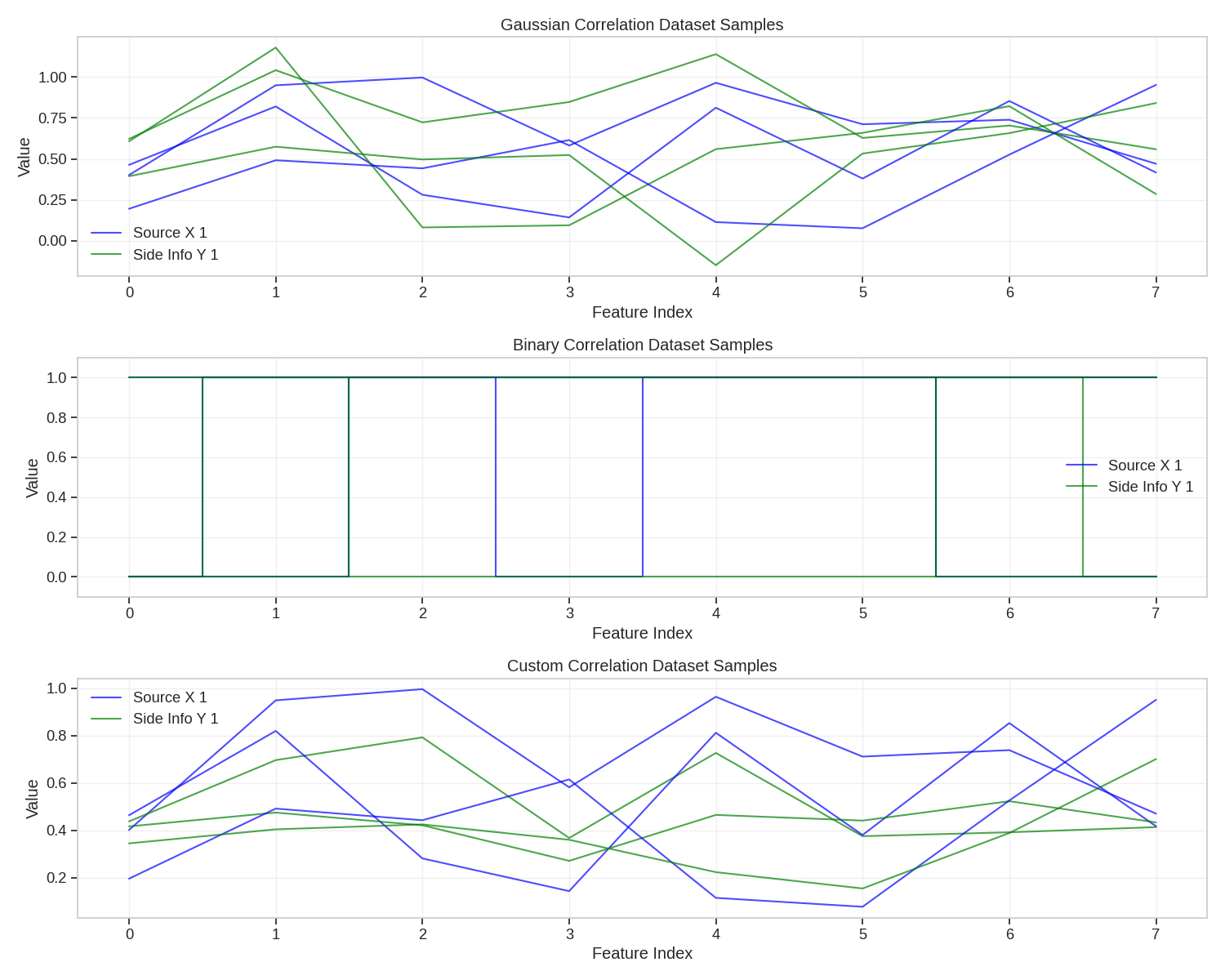
Visualizing Dataset Samples
Let’s visualize some samples from our correlation datasets.
plt.figure(figsize=(15, 12))

# Select a few samples to visualize
sample_indices = [0, 1, 2]

# Plot Gaussian correlation dataset samples
plt.subplot(3, 1, 1)
for i, idx in enumerate(sample_indices):
    x, y = gaussian_dataset[idx]
    plt.plot(x.numpy(), "b-", alpha=0.7, label=f"Source X {i+1}" if i == 0 else "_")
    plt.plot(y.numpy(), "g-", alpha=0.7, label=f"Side Info Y {i+1}" if i == 0 else "_")
plt.title("Gaussian Correlation Dataset Samples")
plt.xlabel("Feature Index")
plt.ylabel("Value")
plt.grid(True, alpha=0.3)
plt.legend()

# Plot Binary correlation dataset samples
plt.subplot(3, 1, 2)
for i, idx in enumerate(sample_indices):
    x, y = binary_dataset[idx]
    plt.step(np.arange(feature_dim), x.numpy(), "b-", where="mid", alpha=0.7, label=f"Source X {i+1}" if i == 0 else "_")
    plt.step(np.arange(feature_dim), y.numpy(), "g-", where="mid", alpha=0.7, label=f"Side Info Y {i+1}" if i == 0 else "_")
plt.title("Binary Correlation Dataset Samples")
plt.xlabel("Feature Index")
plt.ylabel("Value")
plt.ylim(-0.1, 1.1)
plt.grid(True, alpha=0.3)
plt.legend()

# Plot Custom correlation dataset samples
plt.subplot(3, 1, 3)
for i, idx in enumerate(sample_indices):
    x, y = custom_dataset[idx]
    plt.plot(x.numpy(), "b-", alpha=0.7, label=f"Source X {i+1}" if i == 0 else "_")
    plt.plot(y.numpy(), "g-", alpha=0.7, label=f"Side Info Y {i+1}" if i == 0 else "_")
plt.title("Custom Correlation Dataset Samples")
plt.xlabel("Feature Index")
plt.ylabel("Value")
plt.grid(True, alpha=0.3)
plt.legend()

plt.tight_layout()
plt.show()
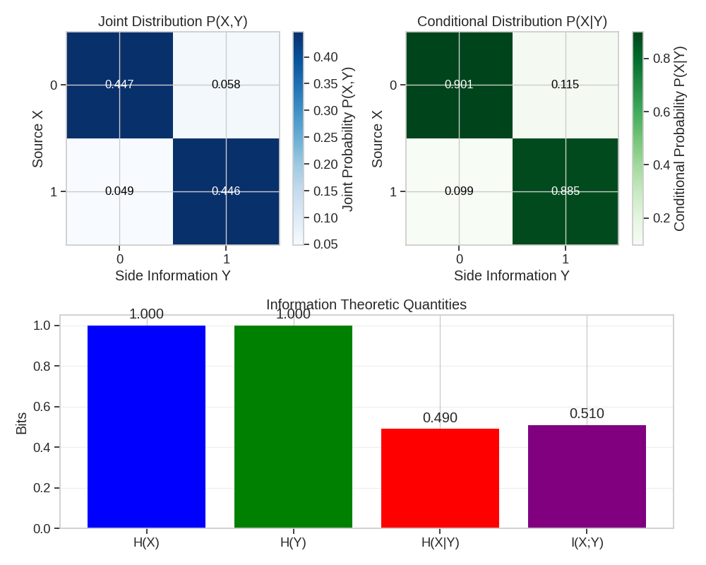
6. Application: Distributed Source Coding Simulation
Let’s demonstrate a practical application where we simulate a basic distributed source coding scenario.
# Generate a larger binary source
n_samples = 1
n_bits = 1000
source_bits = create_binary_tensor(size=[n_samples, n_bits], prob=0.5)

# Create correlated side information (BSC with p=0.1)
correlation_model = WynerZivCorrelationModel(correlation_type="binary", correlation_params={"crossover_prob": 0.1})
side_info = correlation_model(source_bits)

# Calculate the empirical joint distribution
joint_counts = torch.zeros(2, 2)
for i in range(n_bits):
    x = int(source_bits[0, i].item())
    y = int(side_info[0, i].item())
    joint_counts[x, y] += 1

joint_probs = joint_counts / n_bits
marginal_x = joint_probs.sum(dim=1)
marginal_y = joint_probs.sum(dim=0)

# Calculate conditional entropies
H_X_given_Y = 0
for x in range(2):
    for y in range(2):
        if joint_probs[x, y] > 0:
            p_x_given_y = joint_probs[x, y] / marginal_y[y]
            if p_x_given_y > 0:
                H_X_given_Y -= marginal_y[y] * p_x_given_y * np.log2(p_x_given_y)

H_X = -sum(p * np.log2(p) if p > 0 else 0 for p in marginal_x)
H_Y = -sum(p * np.log2(p) if p > 0 else 0 for p in marginal_y)
I_X_Y = H_X - H_X_given_Y  # Mutual information

print("Joint Probability Distribution:")
print(joint_probs)
print(f"Entropy of X: H(X) = {H_X:.4f} bits")
print(f"Entropy of Y: H(Y) = {H_Y:.4f} bits")
print(f"Conditional Entropy: H(X|Y) = {H_X_given_Y:.4f} bits")
print(f"Mutual Information: I(X;Y) = {I_X_Y:.4f} bits")
print(f"Theoretical Rate Savings: {I_X_Y/H_X*100:.2f}%")
/home/runner/work/kaira/kaira/examples/data/plot_correlation_models.py:365: DeprecationWarning: __array_wrap__ must accept context and return_scalar arguments (positionally) in the future. (Deprecated NumPy 2.0)
  H_X_given_Y -= marginal_y[y] * p_x_given_y * np.log2(p_x_given_y)
/home/runner/work/kaira/kaira/examples/data/plot_correlation_models.py:367: DeprecationWarning: __array_wrap__ must accept context and return_scalar arguments (positionally) in the future. (Deprecated NumPy 2.0)
  H_X = -sum(p * np.log2(p) if p > 0 else 0 for p in marginal_x)
/home/runner/work/kaira/kaira/examples/data/plot_correlation_models.py:368: DeprecationWarning: __array_wrap__ must accept context and return_scalar arguments (positionally) in the future. (Deprecated NumPy 2.0)
  H_Y = -sum(p * np.log2(p) if p > 0 else 0 for p in marginal_y)
Joint Probability Distribution:
tensor([[0.4470, 0.0580],
        [0.0490, 0.4460]])
Entropy of X: H(X) = 0.9999 bits
Entropy of Y: H(Y) = 1.0000 bits
Conditional Entropy: H(X|Y) = 0.4903 bits
Mutual Information: I(X;Y) = 0.5096 bits
Theoretical Rate Savings: 50.97%
Visualizing Joint Distribution
plt.figure(figsize=(10, 8))

# Plot joint distribution as a heatmap
plt.subplot(2, 2, 1)
plt.imshow(joint_probs.numpy(), cmap="Blues", interpolation="nearest")
plt.colorbar(label="Joint Probability P(X,Y)")
plt.title("Joint Distribution P(X,Y)")
plt.xlabel("Side Information Y")
plt.ylabel("Source X")
plt.xticks([0, 1], ["0", "1"])
plt.yticks([0, 1], ["0", "1"])

for i in range(2):
    for j in range(2):
        plt.text(j, i, f"{joint_probs[i, j]:.3f}", ha="center", va="center", color="black" if joint_probs[i, j] < 0.4 else "white", fontsize=12)

# Plot conditional distribution P(X|Y) as a heatmap
plt.subplot(2, 2, 2)
cond_probs = joint_probs / marginal_y.unsqueeze(0)
plt.imshow(cond_probs.numpy(), cmap="Greens", interpolation="nearest")
plt.colorbar(label="Conditional Probability P(X|Y)")
plt.title("Conditional Distribution P(X|Y)")
plt.xlabel("Side Information Y")
plt.ylabel("Source X")
plt.xticks([0, 1], ["0", "1"])
plt.yticks([0, 1], ["0", "1"])

for i in range(2):
    for j in range(2):
        plt.text(j, i, f"{cond_probs[i, j]:.3f}", ha="center", va="center", color="black" if cond_probs[i, j] < 0.4 else "white", fontsize=12)

# Plot information theoretic quantities
plt.subplot(2, 1, 2)
labels = ["H(X)", "H(Y)", "H(X|Y)", "I(X;Y)"]
values = [H_X, H_Y, H_X_given_Y, I_X_Y]
plt.bar(labels, values, color=["blue", "green", "red", "purple"])
plt.title("Information Theoretic Quantities")
plt.ylabel("Bits")
plt.grid(axis="y", alpha=0.3)

for i, v in enumerate(values):
    plt.text(i, v + 0.02, f"{v:.3f}", ha="center", va="bottom")

plt.tight_layout()
plt.show()
Conclusion
This example demonstrated the correlation models in Kaira:
Gaussian correlation for continuous-valued sources
Binary symmetric channel correlation for binary sources
Custom correlation through user-defined functions
Using WynerZivCorrelationDataset for paired data
Application to distributed source coding
These models are useful for:
Simulating Wyner-Ziv coding scenarios
Evaluating distributed compression algorithms
Studying rate-distortion tradeoffs with side information
Information theoretic analysis of correlated sources
Total running time of the script: (0 minutes 1.928 seconds)