Note
Go to the end to download the full example code. or to run this example in your browser via Binder
Projections and Cover Tests for Communication Systems
This example demonstrates the usage of projections in Kaira for dimensionality reduction in communication systems, along with techniques to evaluate projection quality using cover tests. Projections are critical for efficient signal representation and transmission in bandwidth-constrained channels.
We’ll visualize three types of projections: 1. Rademacher projections (random binary matrices) 2. Gaussian projections (random Gaussian matrices) 3. Orthogonal projections (matrices with orthogonal columns)
and evaluate their effectiveness using cover tests and reconstruction quality metrics.
These projections have been previously used in (and adapted from) [Yilmaz et al., 2025, Yilmaz et al., 2025].
Imports and Setup
import matplotlib.pyplot as plt
import numpy as np
import seaborn as sns
import torch
from matplotlib.patches import Ellipse
from sklearn.decomposition import PCA
from sklearn.metrics import pairwise_distances

from kaira.metrics.image import PSNR
from kaira.models.components import Projection, ProjectionType
from kaira.utils import seed_everything

# Set seeds for reproducibility
seed_everything(42)

# Set plotting style for better visualization
plt.style.use("seaborn-v0_8-whitegrid")
sns.set_context("notebook", font_scale=1.2)

# Define custom color palette for visualizations
colors = ["#3498db", "#e74c3c", "#2ecc71", "#f39c12", "#9b59b6"]
sns.set_palette(sns.color_palette(colors))
Understanding Projections in Communications
Projections map high-dimensional data to lower-dimensional spaces while preserving important properties of the data. In communications, projections help reduce bandwidth requirements while maintaining signal fidelity.
Kaira implements three types of projections: - Rademacher: Use random matrices with ±1 entries - Gaussian: Use random matrices with entries from N(0, 1/d) - Orthogonal: Use matrices with orthogonal columns
# Create input data for visualization
input_dim = 128
output_dim = 2  # For visualization purposes
n_points = 1000

# Generate random data points with a specific structure (for better visualization)
# We'll create data with a specific covariance structure
cov = torch.eye(input_dim)
cov[0, 1] = cov[1, 0] = 0.8  # Correlation between first two dimensions
x = torch.randn(n_points, input_dim) @ torch.linalg.cholesky(cov)

# Create projection instances for each type
proj_radem = Projection(input_dim, output_dim, projection_type=ProjectionType.RADEMACHER, seed=42)
proj_gauss = Projection(input_dim, output_dim, projection_type=ProjectionType.GAUSSIAN, seed=42)
proj_ortho = Projection(input_dim, output_dim, projection_type=ProjectionType.ORTHOGONAL, seed=42)

# Apply projections
y_radem = proj_radem(x).detach()
y_gauss = proj_gauss(x).detach()
y_ortho = proj_ortho(x).detach()

# Apply PCA for comparison
pca = PCA(n_components=output_dim)
y_pca = torch.tensor(pca.fit_transform(x.numpy()))
Visualizing Projection Results
Let’s visualize how each projection type maps our high-dimensional data to 2D
# Create figure for all projection types
plt.figure(figsize=(16, 12))


# Define confidence ellipse function for visualization
def plot_confidence_ellipse(ax, x, y, color, n_std=2.0, label=None):
    """Plot confidence ellipse for the given data points."""
    cov = np.cov(x, y)
    pearson = cov[0, 1] / np.sqrt(cov[0, 0] * cov[1, 1])

    # Using a special case to obtain the eigenvalues
    ell_radius_x = np.sqrt(1 + pearson)
    ell_radius_y = np.sqrt(1 - pearson)

    # Calculating the ellipse standard deviation
    scale_x = np.sqrt(cov[0, 0]) * n_std
    scale_y = np.sqrt(cov[1, 1]) * n_std

    # Creating the ellipse
    ellipse = Ellipse((0, 0), width=ell_radius_x * 2, height=ell_radius_y * 2, facecolor="none", edgecolor=color, linewidth=2, alpha=0.8)

    # Move ellipse to the correct location
    mean_x, mean_y = np.mean(x), np.mean(y)
    transf = plt.gca().transData
    ellipse.set_transform(transforms.Affine2D().rotate_deg(45).scale(scale_x, scale_y).translate(mean_x, mean_y) + transf)

    ax.add_patch(ellipse)
    if label:
        # Add a text label for the ellipse
        ax.text(mean_x, mean_y, label, fontsize=12, ha="center", va="center", color=color, fontweight="bold")


# Create subfigures for each projection type
projection_types = [("Rademacher Projection", y_radem.numpy(), colors[0]), ("Gaussian Projection", y_gauss.numpy(), colors[1]), ("Orthogonal Projection", y_ortho.numpy(), colors[2]), ("PCA Projection", y_pca.numpy(), colors[3])]

for i, (title, data, color) in enumerate(projection_types):
    ax = plt.subplot(2, 2, i + 1)

    # Plot the projected data points
    ax.scatter(data[:, 0], data[:, 1], alpha=0.6, s=30, color=color)

    # Get min and max values for consistent axes
    x_min, x_max = data[:, 0].min() - 0.5, data[:, 0].max() + 0.5
    y_min, y_max = data[:, 1].min() - 0.5, data[:, 1].max() + 0.5

    # Plot vector arrows representing the principal directions in the projected space
    if i == 3:  # Only for PCA
        for j, (comp, var) in enumerate(zip(pca.components_, pca.explained_variance_)):
            # Plot the principal component as a vector
            arrow_scale = 3.0
            plt.arrow(0, 0, arrow_scale * comp[0], arrow_scale * comp[1], head_width=0.3, head_length=0.3, fc=colors[j], ec=colors[j])
            # Add a label showing the explained variance
            plt.text(arrow_scale * comp[0] * 1.15, arrow_scale * comp[1] * 1.15, f"PC{j+1}\n({var:.1%})", color=colors[j], fontweight="bold")

    # Calculate and plot 95% confidence ellipse
    from matplotlib import transforms

    plot_confidence_ellipse(ax, data[:, 0], data[:, 1], color)

    ax.set_title(title, fontsize=14, fontweight="bold")
    ax.set_xlabel("Projected Dimension 1")
    ax.set_ylabel("Projected Dimension 2")
    ax.set_xlim(x_min, x_max)
    ax.set_ylim(y_min, y_max)
    ax.grid(True, alpha=0.3)
    ax.axhline(y=0, color="k", linestyle="-", alpha=0.3)
    ax.axvline(x=0, color="k", linestyle="-", alpha=0.3)

plt.tight_layout()
plt.suptitle("Comparison of Different Projection Types", fontsize=20, y=1.02)
plt.show()

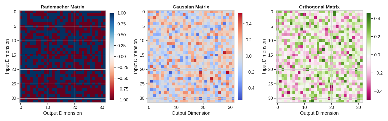
Projection Matrices Visualization
Let’s visualize the actual projection matrices to understand their structures
# Create higher-dimensional projection matrices for better visualization
input_dim_visual = 32
output_dim_visual = 32

# Create projection instances for each type
proj_radem_visual = Projection(input_dim_visual, output_dim_visual, projection_type=ProjectionType.RADEMACHER, seed=42)
proj_gauss_visual = Projection(input_dim_visual, output_dim_visual, projection_type=ProjectionType.GAUSSIAN, seed=42)
proj_ortho_visual = Projection(input_dim_visual, output_dim_visual, projection_type=ProjectionType.ORTHOGONAL, seed=42)

# Extract projection matrices
radem_matrix = proj_radem_visual.projection.detach().numpy()
gauss_matrix = proj_gauss_visual.projection.detach().numpy()
ortho_matrix = proj_ortho_visual.projection.detach().numpy()

# Create figure for visualizing matrices
plt.figure(figsize=(16, 5))

# Define titles, matrices, and color maps for each projection
matrices = [("Rademacher Matrix", radem_matrix, "RdBu"), ("Gaussian Matrix", gauss_matrix, "coolwarm"), ("Orthogonal Matrix", ortho_matrix, "PiYG")]

for i, (title, matrix, cmap) in enumerate(matrices):
    ax = plt.subplot(1, 3, i + 1)
    im = ax.imshow(matrix, cmap=cmap, aspect="auto")
    ax.set_title(title, fontsize=14, fontweight="bold")
    plt.colorbar(im, ax=ax, fraction=0.046, pad=0.04)
    ax.set_xlabel("Output Dimension")
    ax.set_ylabel("Input Dimension")

plt.tight_layout()
plt.suptitle("Visualization of Different Projection Matrices", fontsize=20, y=1.05)
plt.show()
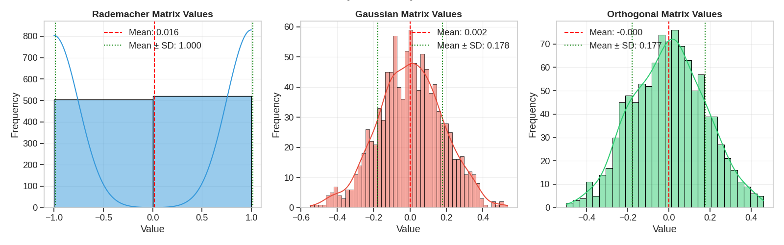
Cover Test: Column/Row Distribution Analysis
In cover tests, we analyze how well the projections preserve distances between points and how well they cover the space. We also examine the distribution of values in the projection matrices.
# Create histograms of the matrix values
plt.figure(figsize=(16, 5))

# Define histogram data for each matrix
hist_data = [("Rademacher Matrix Values", radem_matrix.flatten(), colors[0], 2), ("Gaussian Matrix Values", gauss_matrix.flatten(), colors[1], 50), ("Orthogonal Matrix Values", ortho_matrix.flatten(), colors[2], 30)]

for i, (title, data, color, bins) in enumerate(hist_data):
    ax = plt.subplot(1, 3, i + 1)

    # Plot histogram
    sns.histplot(data, bins=bins, kde=True, color=color, ax=ax)

    # Add vertical lines for mean and standard deviation
    mean_val = np.mean(data)
    std_val = np.std(data)
    ax.axvline(x=mean_val, color="red", linestyle="--", label=f"Mean: {mean_val:.3f}")
    ax.axvline(x=mean_val + std_val, color="green", linestyle=":", label=f"Mean ± SD: {std_val:.3f}")
    ax.axvline(x=mean_val - std_val, color="green", linestyle=":")

    ax.set_title(title, fontsize=14, fontweight="bold")
    ax.set_xlabel("Value")
    ax.set_ylabel("Frequency")
    ax.grid(True, alpha=0.3)
    ax.legend()

plt.tight_layout()
plt.suptitle("Distribution Analysis of Projection Matrix Values", fontsize=20, y=1.05)
plt.show()
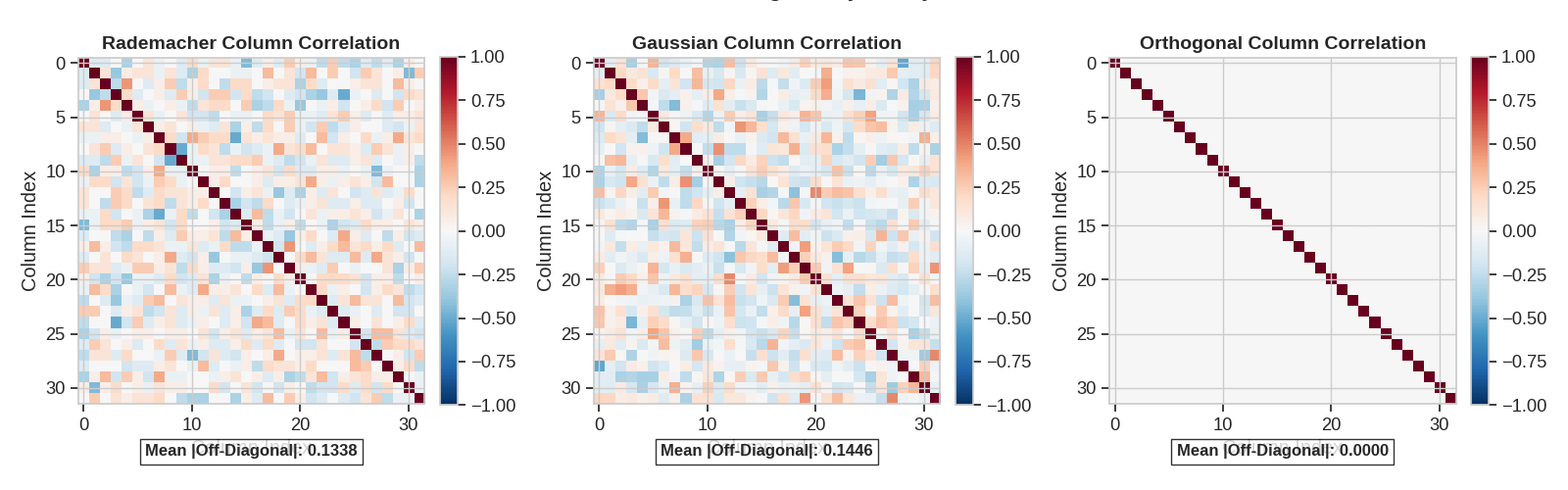
Column Orthogonality Analysis
A key property of good projections is the orthogonality of columns. Let’s examine the dot products between columns for each projection type.
# Calculate column dot products
def column_dot_products(matrix):
    """Calculate the normalized dot products between columns of a matrix.

    This function computes a matrix of normalized dot products between all pairs of columns
    in the input matrix. The result is a square matrix where each element (i,j) represents
    the cosine similarity between columns i and j. This is useful for assessing column
    orthogonality in projection matrices, where values close to zero for off-diagonal
    elements indicate better orthogonality.

    Args:
        matrix (numpy.ndarray): The input matrix whose columns will be compared.

    Returns:
        numpy.ndarray: A square matrix of normalized dot products where element (i,j)
            is the cosine similarity between columns i and j.
    """
    columns = matrix.T  # Transpose to get columns as rows
    n_cols = columns.shape[0]
    products = np.zeros((n_cols, n_cols))

    for i in range(n_cols):
        for j in range(n_cols):
            products[i, j] = np.dot(columns[i], columns[j])

    # Normalize by the column norms
    for i in range(n_cols):
        for j in range(n_cols):
            products[i, j] /= np.linalg.norm(columns[i]) * np.linalg.norm(columns[j])

    return products


radem_dot = column_dot_products(radem_matrix)
gauss_dot = column_dot_products(gauss_matrix)
ortho_dot = column_dot_products(ortho_matrix)

# Visualize dot products
plt.figure(figsize=(16, 5))

dot_products = [("Rademacher Column Correlation", radem_dot, "RdBu_r"), ("Gaussian Column Correlation", gauss_dot, "RdBu_r"), ("Orthogonal Column Correlation", ortho_dot, "RdBu_r")]

for i, (title, matrix, cmap) in enumerate(dot_products):
    ax = plt.subplot(1, 3, i + 1)
    im = ax.imshow(matrix, cmap=cmap, vmin=-1, vmax=1)
    ax.set_title(title, fontsize=14, fontweight="bold")
    plt.colorbar(im, ax=ax, fraction=0.046, pad=0.04)
    ax.set_xlabel("Column Index")
    ax.set_ylabel("Column Index")

    # Add text for the mean off-diagonal correlation
    off_diag = matrix.copy()
    np.fill_diagonal(off_diag, 0)
    mean_off_diag = np.sum(np.abs(off_diag)) / (off_diag.size - matrix.shape[0])
    ax.text(0.5, -0.15, f"Mean |Off-Diagonal|: {mean_off_diag:.4f}", transform=ax.transAxes, ha="center", fontsize=12, fontweight="bold", bbox=dict(facecolor="white", alpha=0.8))

plt.tight_layout()
plt.suptitle("Column Orthogonality Analysis", fontsize=20, y=1.05)
plt.show()
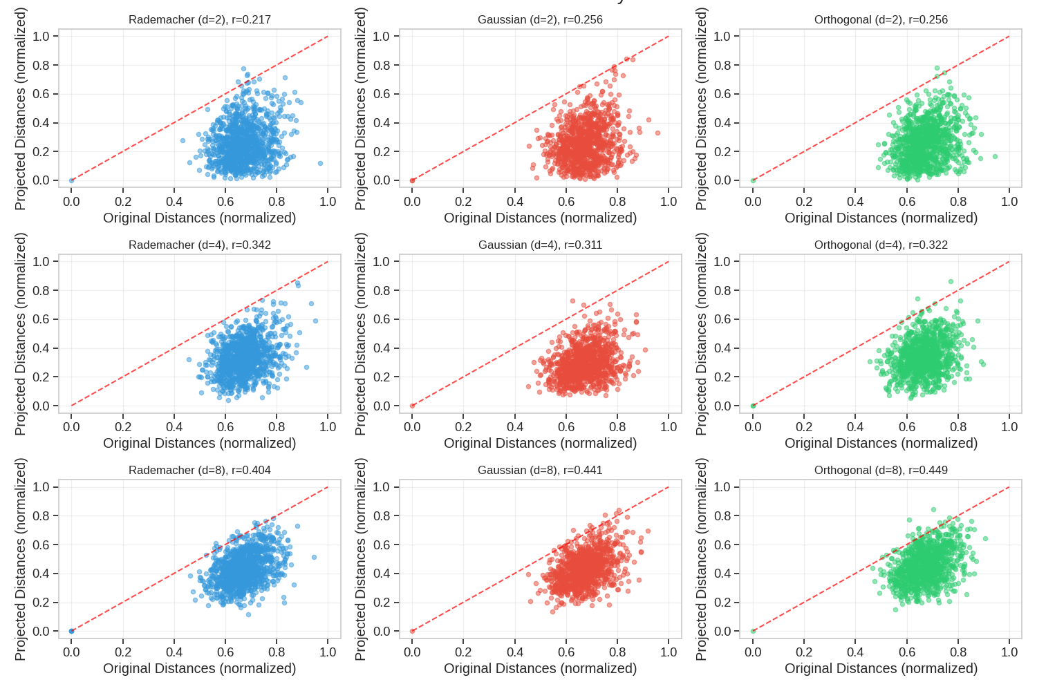
Distance Preservation Test
A crucial property of good projections is how well they preserve distances between points. Let’s evaluate this for each projection type.
# Create new dataset with more structure
n_samples = 500
dim = 64
output_dims = [2, 4, 8, 16, 32]

# Generate data with a specific covariance structure
cov = torch.eye(dim)
for i in range(dim - 1):
    cov[i, i + 1] = cov[i + 1, i] = 0.5

data = torch.randn(n_samples, dim) @ torch.linalg.cholesky(cov)

# Calculate original pairwise distances
original_dists = pairwise_distances(data.numpy())

# Set up figure for plotting
plt.figure(figsize=(15, 10))

# Track distance preservation metrics for each projection type and dimension
preservation_metrics: dict[str, list[float]] = {
    "Rademacher": [],
    "Gaussian": [],
    "Orthogonal": [],
}

# For each output dimension
for dim_idx, out_dim in enumerate(output_dims):
    # Create projections
    proj_types = {
        "Rademacher": Projection(dim, out_dim, projection_type=ProjectionType.RADEMACHER, seed=42),
        "Gaussian": Projection(dim, out_dim, projection_type=ProjectionType.GAUSSIAN, seed=42),
        "Orthogonal": Projection(dim, out_dim, projection_type=ProjectionType.ORTHOGONAL, seed=42),
    }

    # Project data and calculate distances for each projection type
    for name, proj in proj_types.items():
        # Project the data
        projected = proj(data).detach().numpy()

        # Calculate pairwise distances in the projected space
        proj_dists = pairwise_distances(projected)

        # Normalize distances for fair comparison
        norm_orig_dists = original_dists / np.max(original_dists)
        norm_proj_dists = proj_dists / np.max(proj_dists)

        # Calculate correlation between original and projected distances
        corr = np.corrcoef(norm_orig_dists.flatten(), norm_proj_dists.flatten())[0, 1]
        preservation_metrics[name].append(corr)

        # Plot scatter for first 3 dimensions only to avoid cluttering
        if dim_idx < 3:
            ax = plt.subplot(3, 3, dim_idx * 3 + list(proj_types.keys()).index(name) + 1)

            # Sample a subset of points for clarity in visualization
            sample_size = 1000
            sample_indices = np.random.choice(len(norm_orig_dists.flatten()), sample_size, replace=False)

            orig_sample = norm_orig_dists.flatten()[sample_indices]
            proj_sample = norm_proj_dists.flatten()[sample_indices]

            ax.scatter(orig_sample, proj_sample, alpha=0.5, s=20, color=colors[list(proj_types.keys()).index(name)])
            ax.plot([0, 1], [0, 1], "r--", alpha=0.7)  # Ideal line

            ax.set_title(f"{name} (d={out_dim}), r={corr:.3f}", fontsize=12)
            ax.set_xlabel("Original Distances (normalized)")
            ax.set_ylabel("Projected Distances (normalized)")
            ax.grid(True, alpha=0.3)

plt.tight_layout()
plt.suptitle("Distance Preservation Analysis", fontsize=20, y=1.02)
plt.show()
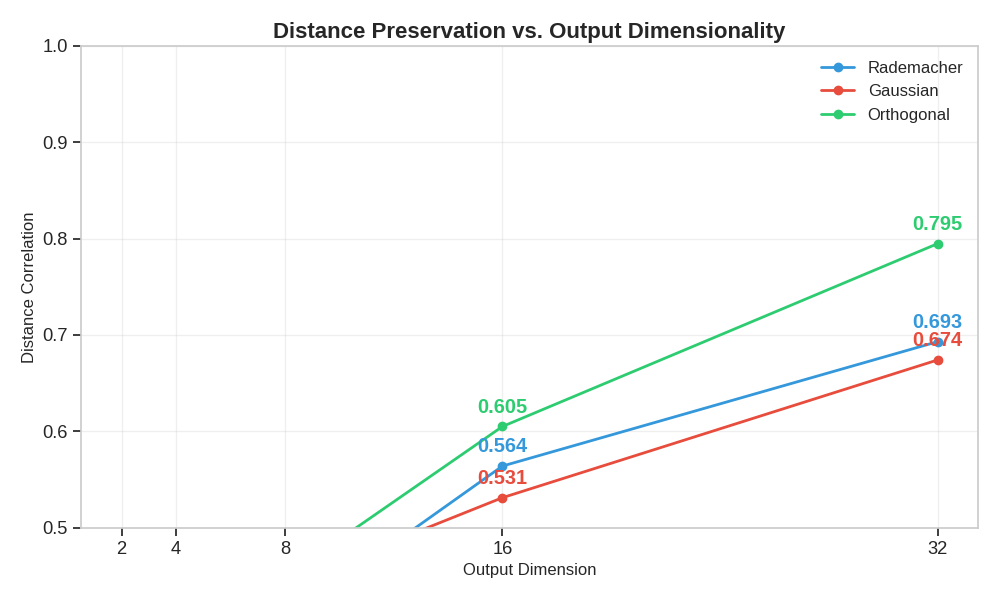
Distance Preservation by Dimensionality
Let’s plot how distance preservation improves with increasing output dimensions
plt.figure(figsize=(10, 6))

for name, metrics in preservation_metrics.items():
    plt.plot(output_dims, metrics, "o-", linewidth=2, label=name, color=colors[list(preservation_metrics.keys()).index(name)])

plt.xlabel("Output Dimension", fontsize=12)
plt.ylabel("Distance Correlation", fontsize=12)
plt.title("Distance Preservation vs. Output Dimensionality", fontsize=16, fontweight="bold")
plt.grid(True, alpha=0.3)
plt.legend(fontsize=12)
plt.xticks(output_dims)
plt.ylim(0.5, 1.0)

# Add annotations
for name, metrics in preservation_metrics.items():
    color = colors[list(preservation_metrics.keys()).index(name)]
    for i, (dim, val) in enumerate(zip(output_dims, metrics)):
        plt.annotate(f"{val:.3f}", (dim, val), textcoords="offset points", xytext=(0, 10), ha="center", color=color, fontweight="bold")

plt.tight_layout()
plt.show()
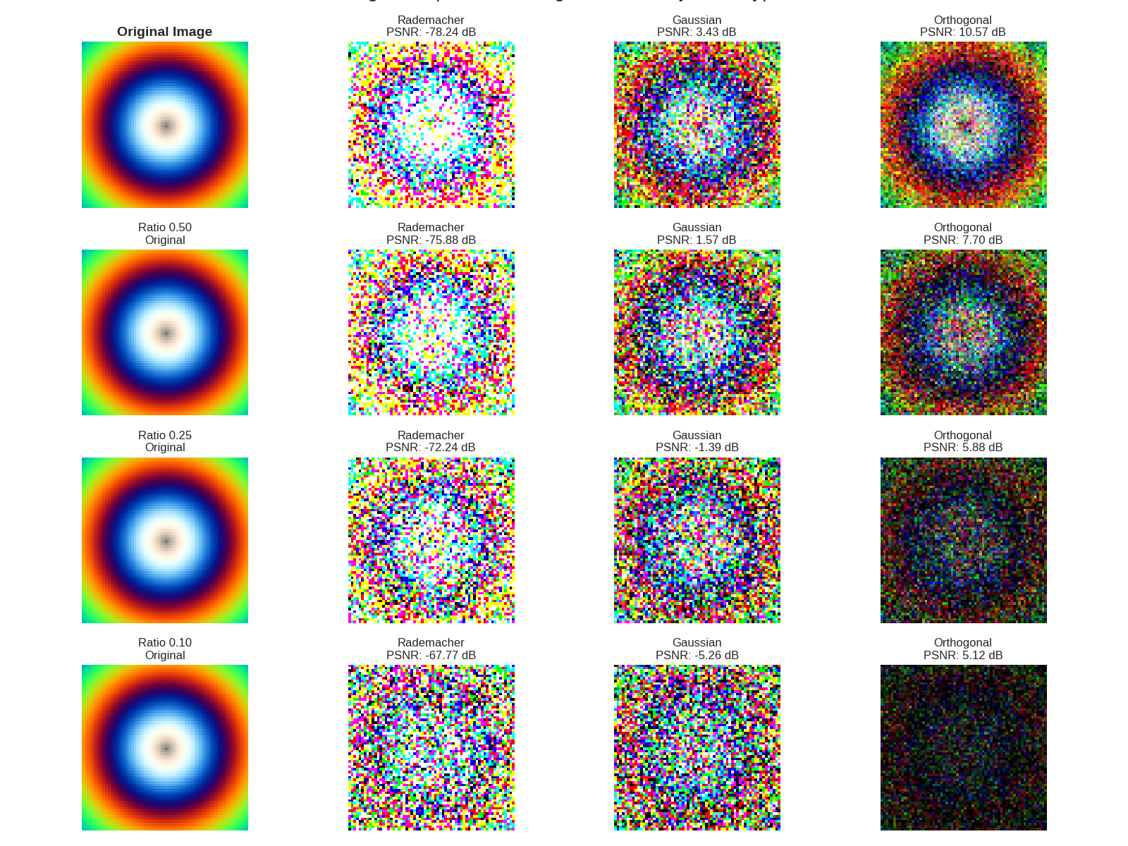
Practical Application: Image Projection and Reconstruction
Let’s see how each projection type performs in a practical image compression scenario
# Create a simple image for demonstration (a synthetic pattern)
image_size = 64
channels = 3
image = torch.zeros(1, channels, image_size, image_size)

# Create a pattern (concentric circles)
for i in range(image_size):
    for j in range(image_size):
        # Calculate distance from center
        d = np.sqrt((i - image_size / 2) ** 2 + (j - image_size / 2) ** 2)

        # Create concentric circles pattern
        image[0, 0, i, j] = 0.5 + 0.5 * np.sin(d * 0.25)  # Red channel
        image[0, 1, i, j] = 0.5 + 0.5 * np.sin(d * 0.2)  # Green channel
        image[0, 2, i, j] = 0.5 + 0.5 * np.sin(d * 0.15)  # Blue channel

# Reshape the image for projection
orig_shape = image.shape
flat_image = image.view(1, -1)  # Flatten to [1, C*H*W]
input_features = flat_image.shape[1]

# Define compression ratios to test
compression_ratios = [0.75, 0.5, 0.25, 0.1]
output_features_list = [int(input_features * ratio) for ratio in compression_ratios]

# Set up figure for plotting
fig = plt.figure(figsize=(16, len(compression_ratios) * 3))
gs = plt.GridSpec(len(compression_ratios), 4, figure=fig)

# Add original image at the top
ax_orig = fig.add_subplot(gs[0, 0])
ax_orig.imshow(image[0].permute(1, 2, 0).numpy().clip(0, 1))
ax_orig.set_title("Original Image", fontsize=14, fontweight="bold")
ax_orig.axis("off")

# PSNR metric for quality assessment
psnr_metric = PSNR()

# For each compression ratio
for row, (ratio, output_features) in enumerate(zip(compression_ratios, output_features_list)):
    # Create projections for each type
    proj_radem = Projection(input_features, output_features, projection_type=ProjectionType.RADEMACHER, seed=42)
    proj_gauss = Projection(input_features, output_features, projection_type=ProjectionType.GAUSSIAN, seed=42)
    proj_ortho = Projection(input_features, output_features, projection_type=ProjectionType.ORTHOGONAL, seed=42)

    # Project the data
    radem_proj = proj_radem(flat_image)
    gauss_proj = proj_gauss(flat_image)
    ortho_proj = proj_ortho(flat_image)

    # Reconstruct the data using direct matrix multiplication with the transpose
    # instead of using a Linear layer
    radem_recon = (radem_proj @ proj_radem.projection.t()).view(orig_shape)
    gauss_recon = (gauss_proj @ proj_gauss.projection.t()).view(orig_shape)
    ortho_recon = (ortho_proj @ proj_ortho.projection.t()).view(orig_shape)

    # Calculate PSNR metrics
    radem_psnr = psnr_metric(radem_recon, image).item()
    gauss_psnr = psnr_metric(gauss_recon, image).item()
    ortho_psnr = psnr_metric(ortho_recon, image).item()

    # Plot reconstructions
    reconstructions = [(f"Ratio {ratio:.2f}\nOriginal", image if row > 0 else None), (f"Rademacher\nPSNR: {radem_psnr:.2f} dB", radem_recon), (f"Gaussian\nPSNR: {gauss_psnr:.2f} dB", gauss_recon), (f"Orthogonal\nPSNR: {ortho_psnr:.2f} dB", ortho_recon)]

    for col, (title, img) in enumerate(reconstructions):
        if img is not None:
            ax = fig.add_subplot(gs[row, col])
            ax.imshow(img[0].permute(1, 2, 0).detach().numpy().clip(0, 1))
            ax.set_title(title, fontsize=12)
            ax.axis("off")

plt.tight_layout()
plt.suptitle("Image Compression Using Different Projection Types", fontsize=20, y=1.02)
plt.show()
Conclusion
This example has demonstrated:
Three Types of Projections: Rademacher, Gaussian, and Orthogonal projections each with unique statistical properties
Cover Tests: Analysis of how well projections preserve distances and cover the space, which is critical for communication systems
Dimensionality Tradeoffs: How the quality of projection improves with output dimensionality, allowing system designers to balance between compression ratio and quality
Application to Image Compression: A practical demonstration showing how projections can be used for bandwidth-efficient image transmission
Key observations:
Orthogonal projections consistently provide better distance preservation than Rademacher or Gaussian
All projection types maintain better distance preservation as output dimensionality increases
For image reconstruction, orthogonal projections achieve higher PSNR at the same compression ratio
Rademacher projections are computationally efficient but less accurate for reconstruction
These projection methods can be applied to various communication tasks including: - Source coding with side information - Multiple access channels - Joint source-channel coding - Streaming scenarios with time-varying channels
Total running time of the script: (0 minutes 43.737 seconds)